Panzer Battles - June 2017 Update (Part One)
Hi there,
We’ve been super busy here and I’ll take responsibility for the slow pace of blog posts. That said, it’s not an indication that the actual game development work has slowed down.
In the last post, we updated you all on where we’re at with Panzer Campaigns. There was a very positive response from the community and many suggestions on areas to focus or upgrade. Be assured work continues apace on that series.
This post and the next, will give you an overall look at the work currently underway on Panzer Battles.
The release of the Demo has gone exceptionally well and the number of downloads has exceeded our expectations. There has also been a definite increase in the purchase of the first two released title, Kursk and Normandy after people have tried the Demo.
We have also received feedback on things people like and dislike. Some are related to the user interface; others are with game features or wish-lists of battles to be covered. All in all, the Demo has achieved what we hoped for.
Currently our work on Panzer Battles is broken into three broad areas;
- Enhancing the Game System through code changes. For example; the user interface, game calculations, reporting and new features
- Optimising our tools for both development and research
- Building New Titles and retrofitting prior releases
For the first of these; enhancing the Game System, we have found feedback from our testing teams and the community invaluable. For example, in the wake of the Demo release people mentioned that the Icon set was ‘too green’. The colours do represent ‘like’ function and there was logic for the attribution, but it was not a big change to further segment the range of colours.
From Panzer Battles 3 and subsequently when we patch all other titles we will include a new icon toolbar. Below you can see what has changed. The top graphic are the current icons set and below are the proposed new ones. The Green icons have been broken into three groups. Tan is for 'shade commands' such as movement, command and weapon ranges. Khaki is for unit and other highlight commands. Green is for all others, usually map and other miscellaneous functions.
(All images can be clicked for full size)
Beyond the user interface, we have had some pretty intense conversations around changes and enhancements to the game system. Some examples of the items that have been debated;
- Artillery spotting
- Artillery effects vs direct fire
- Range attenuation
- Victory point calculations
- Combat calculations
- AI and scripting enhancements
- Carrying Load limits
- Fog of war enhancements
Stemming from many of these debates, we realised that we didn’t exactly understand how each of the in-game values worked. The included manuals usually hint at impacts but rarely lay out the actual calculations. Berto our programmer decided that we need to have a way to understand some of the calculations in the code, ideally where the development team could follow rather than require a programmer to explain it each time.
Berto managed to build a ‘pseudo code’ that works in a browser with hyperlinks that allowed you to dissect and review the game code functions. Here is an example of the top page for the various types of attacks or fire;
You can see the various hyperlinks in blue, clicking on each drop you down another level in the code so the function you want to examine is available for review. Here is the first page after clicking on the Assault::Assault Resolve link. Each of the links in blue shown here are further access to the applicable code;
Having this Pseudo code has allowed the development team to understand more about what the code does in various situations and more importantly what factors come into play in each calculation. It makes it much easier to understand the interaction of all the games components and items such as unit values and the interplay with parameter data values makes much more sense.
The pseudo code is an example of the new development toolsets we now have available. Mike Avanzini has also been hard at work standardising the actual in game data. Originally when creating the Demo, we expected to pick up components from released titles and build a few new scenarios. It quickly became evident that the breadth of period covered in the Demo would require us to standardise many of our naming conventions as there was impacts with artwork, reporting and even covering multiple geographic theatres. For example, the Germans fought on the Eastern & Western Fronts as well as the Desert from 1939 through 1945; in many cases, simultaneously with different load outs and squad and platoon layouts. Covering the amount of variations was impossible with the force structures setup in Kursk and Normandy. The Demo meant we had to go back to the beginning and define how to cover off all nationalities for the period of the war.
Mike spent a month, building out possible reporting structures and once reviewed rolled it out for the Demo. Here is an example of the layout for a Soviet regular and Guard unit.
The first thing to note, is that there is no longer a differentiator between Guard and standard Red Army components. We are using identical names for the components regardless of what arm of the USSR forces it is. The same has been done with the Germans with the ‘SS’ designation being removed. The format for men based units will nearly always be based off the following (in order);
- Year, usually between 39 to 45
- Type of unit, Rifle, MG, Sapper etc
- Size of unit usually platoon or squad (for German units, zug & gruppe)
- Parent Formation type. This is optional but some units had similar platoons that were different sizes
- Movement basis, usually foot, horse, motorised or armoured
- The Demo additionally included a ‘theatre’ indicator with (w) for Western Front, (e) for Eastern Front and (d) for Desert. This suffix will rarely be used as we don’t expect to mix theatres very often. That said it is needed for our upcoming Desert title with the inclusion of both North Africa and Crete
The main reason for going down this path is that we can now build standard templates of formations within the Order of Battle editor and hand them out to our scenario designers. Additionally, all the artwork will not have to be renamed with each new release but can be included with each template. This approach is saving us a huge amount of time setting up new titles and scenarios.
Mike has now created several orders of battle and has now moved across to map making as that requires as much effort as the orders of battle. Mike has spent the bulk of his time working on Russian maps. This is not an indication of our preferred next title(s) but rather another resource we can hand out to our scenarios designers to work on immediately. Their work will ultimately end up either in the Demo or as full titles.
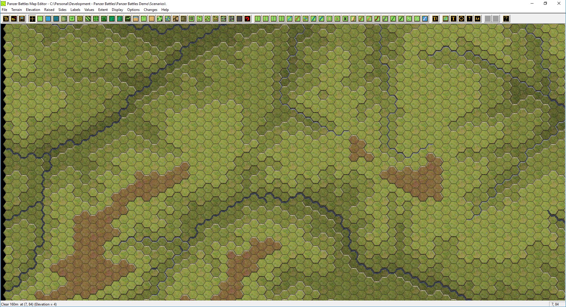
Following are maps from four different campaigns in various states of completion. Can you work out what operations we’re planning to cover? The maps are shown in order with the map source first and then the current state of the in-game map following. All images are at the medium zoom level.
We’ve covered a lot in this post, showing some of the behind the scenes work that is going on. The next post will cover off the state of Panzer Battles 3, highlighting the work done to date and what’s left to do.
Till next time....


Leave a comment